We’ve just released the latest version of our own PeepSo app. This version showcases the newest generation of our internal App SDK (version 260202), the same technology we use to build all PeepSo apps, including the one we can build for you!
While some of the changes are visible right away, others are under-the-hood, and improve how the app feels, performs, and adapts to different devices.
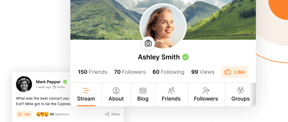
Our app service is available as a standalone purchase, or a part of the PeepSo Power Suite.
Design changes
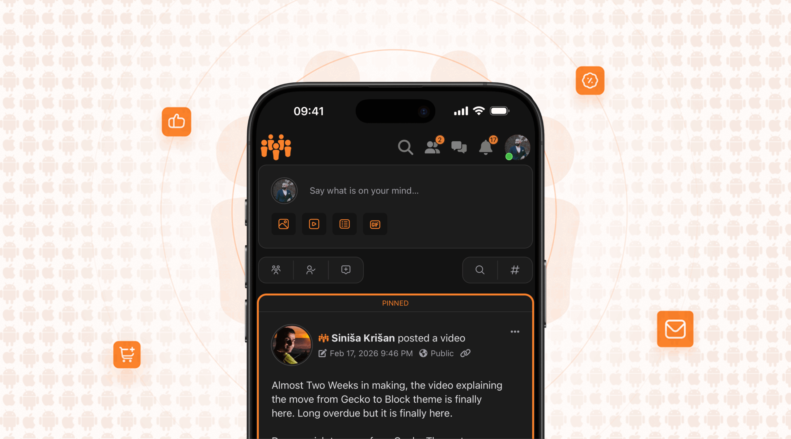
The newest version of our App SDK introduces updates to colors, layout, and navigation. The goal is a cleaner, more modern interface that feels at home on today’s devices.
That said, when we build an app for you, we don’t lock you into a single look. There’s still plenty of creative freedom to adapt the app to your website’s style and brand – colors, layout choices, and behavior can all be adjusted.
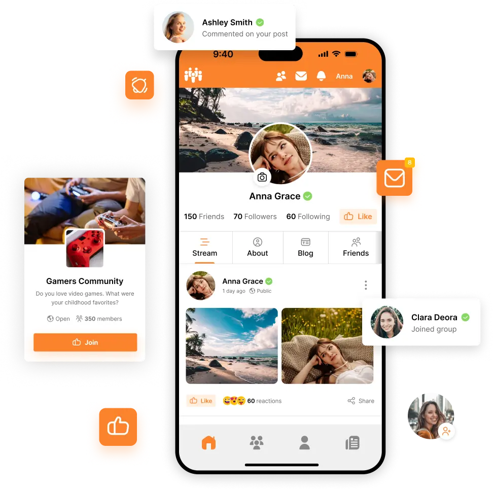
A more natural header
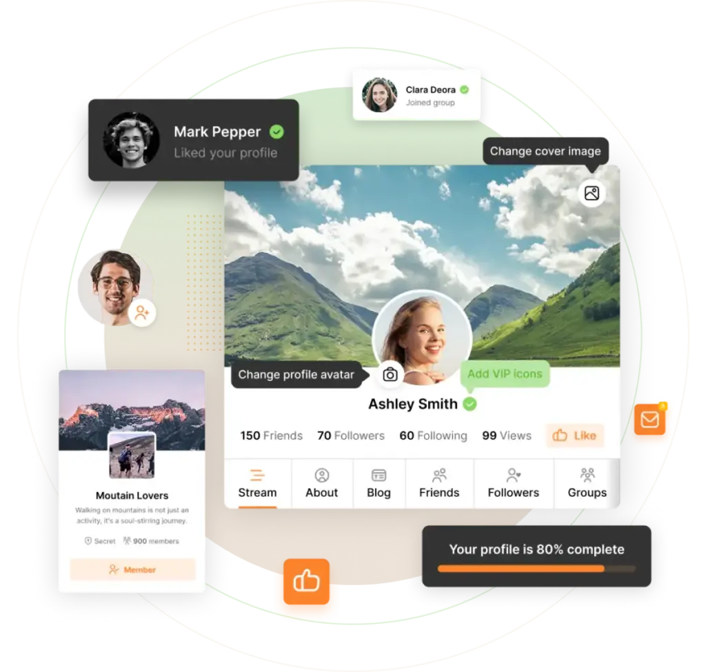
The app header now blends into the rest of the app by default, using the website’s background color. This creates a more organic, less “boxed-in” look.
As you scroll, the header collapses completely, leaving just a subtle, semi-transparent gradient under the system status bar (time, battery, etc.). The result is more room for what matters most: the content.
Prefer a bolder header? Always visible? Not a problem! When designing an app for you, we can:
- Adjust colors and spacing
- Use a vivid header background instead of a blended one
- Disable header collapse on scroll
- Hide or rearrange icons, logo, or even move the user avatar to the bottom navigation
Liquid Glass and subtle transparency
On newer Apple devices (iOS / iPadOS 26 and later), we now take advantage of Liquid Glass, a new visual effect that adds depth and softness to the interface.
On Android devices or older iOS versions, the app automatically falls back to blur or solid colors, so everything still looks right and performs well.
If the user enables “Reduce Transparency”, all semi-transparent elements will switch to solid colors.
In a few places, we also utilize soft semitransparent gradients above scrolling content. These help visually fade content edges and make transitions feel smoother, without getting in the way.
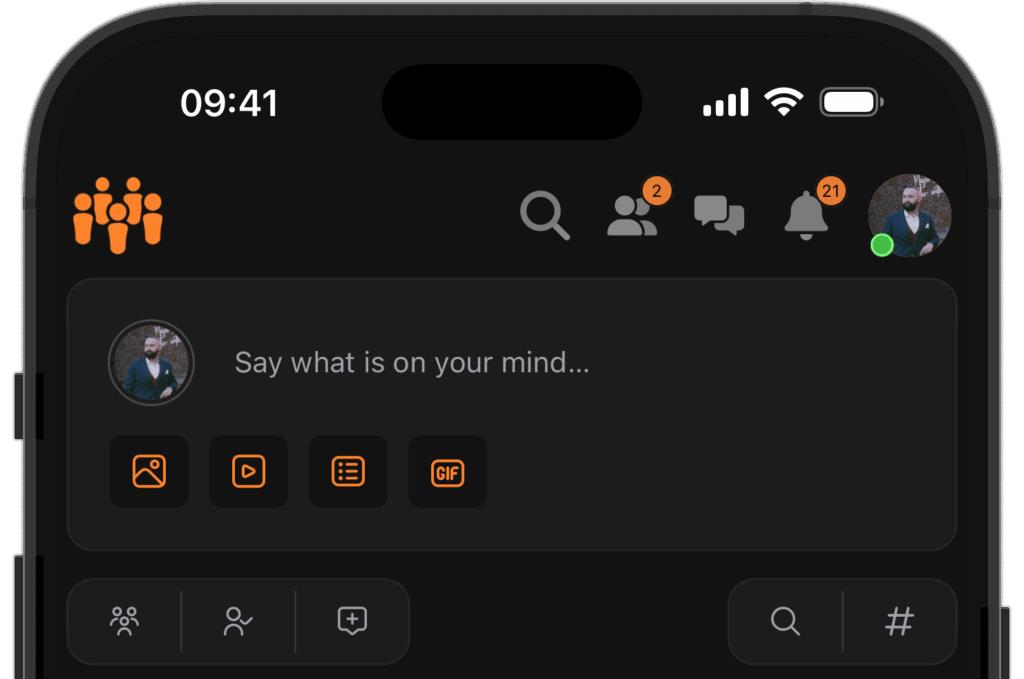
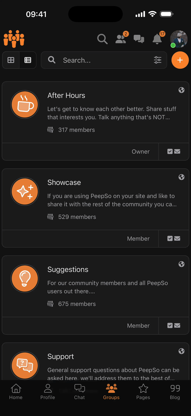
Bottom navigation
The bottom navigation now uses Liquid Glass where supported. As you scroll, the menu becomes more compact: icons shrink slightly, and labels disappear
Combined with the collapsing header, this opens up more space for the content.
Just like the header, this area is fully configurable:
- The “shrink on scroll” behavior can be disabled
- Glass and blur effects are optional
- All colors, labels & icons can be customized (and labels are optional)
Sidebar
The latest SDK ships with a redesigned sidebar system:
- Full-width on phones
- Behaves like a classic sidebar on tablets
- Shows collapsible sections for profile and community navigation
- The buttons such as Preferences, Log Out and Color Switcher were redesigned and repositioned
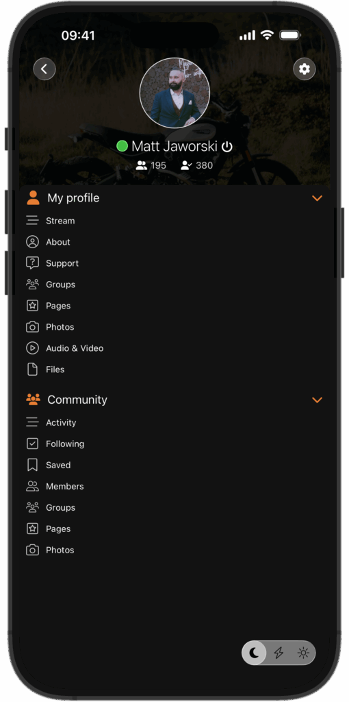
The biggest improvement here isn’t visual, but technical.
We’ve added a templating engine that allows each app to have a completely custom sidebar layout. You’re no longer limited to a predefined structure.
What our customers are already doing with it:
- Replacing the default navigation with fully custom sections
- Mixing collapsible areas with large, clickable headers
- Creating a horizontally scrollable city map, where buildings link to different areas of the site
If you can imagine it, we can now build it!
Disclaimer: some advanced configuration might require a custom code contract.
Technical improvements
PeepSo Block Theme (beta)
Our App SDK now supports the PeepSo Block Theme:
- Elements irrelevant to the app (headers, footers, sidebars) are automatically removed
- Light and dark mode switching is supported
The app can now switch between light and dark mode instantly, without reloading the page. This is because the Block Theme handles theme switching in the front-end (with JavaScript).
WebView
At its core, the app is powered by a WebView – the native component that renders your website inside the app. Over the last six months, this has been heavily refined.
What this means for users:
- Smoother scrolling
- Faster navigation
- Less memory and battery usage
- Better handling of links (internal pages, pop-ups, external sites)
- Proper spacing when content sits behind the bottom navigation
In short: the app feels faster, more responsive, and more polished than ever.
Better Messages
We’ve worked closely with the Better Messages team to improve how their plugin integrates with our app.
Key improvements include:
- Improved handling of touch and scroll interactions
- Improved layout
- Preventing the device from automatically locking during voice or video calls
- Due to technical limitations of this integration, if the device is locked, we lose access to the microphone
Improved tablet support and split-screen behavior
Tablets are increasingly used in split-screen, floating, or windowed modes. In previous generations of apps, this sometimes meant awkward layouts, if the user squeezed the app into a very small view.
The latest version of our App SDK handles this much more gracefully, by not only detecting the device type, but also adapting to the canvas available.
The app now adapts in real time to the available screen size. Whether it’s running full-screen, side-by-side with another app, or in a narrow floating window, the layout adjusts automatically to stay usable and readable. This improvement applies to all large devices, not only tablets, but also very large/foldable phones.
Under the hood, this is powered by responsive design, similar to how modern websites adapt to different screen sizes. The important part is what users experience:
- When there’s plenty of space, the app uses a tablet-optimized layout
- When the window becomes narrow (for example in a small floating window), the app automatically switches to a compact, “phone-style” layout
This makes the app feel natural on tablets and unusually large phones, regardless of how users prefer to multitask.
Final thoughts
This release isn’t just about visual polish – it’s about flexibility, performance, and giving you more control over how your app looks and behaves.
If you’re curious how these changes could translate into a custom app for your community, we’re happy to explore the options with you.
Make Your Community Mobile
PeepSo now offers a seamless solution to transform your PeepSo-based community into a powerful mobile app. No third-party integrations needed.
Everything you need to create, manage, and grow your mobile community is built directly by us for You and Your Community. Imagine the unlimited access to Your Community in the palm of your hand.
Reactions & comments
Comments