PeepSo and Divi Theme are a match made in heaven. PeepSo itself is responsive and does adapt to the device size. However, we can take it a step further. That would be by making PeepSo edge-to-edge and here’s how you can do it with Divi Builder and some simple CSS.
In the first step you have to add Custom CSS class, to do this go to Appearance > Customize > Additional CSS. Now add code below and save changes by pressing Publish button above:
@media screen and (max-width: 980px) {
.full-width-mobile > .et_pb_row { width:100% !important; max-width: 100% !important; }
}
Code notes:
980px – above this number our code will be disabled and sidebars will appear.
.full-width-mobile – this is our class name, you can modify it but keep in mind we will use it in the next steps.
Second step, we have to edit each PeepSo page which we want to make full width on mobile view. These are the most common and default PeepSo pages:
- Recent Activity
- Members
- Groups
- Messages
- User profile
- Register
- Password Recover
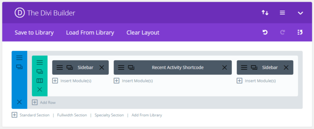
Start with Recent Activity and once done do the same for the other pages. It’s as simple as copy & paste. Instead of default WordPress text editor, use Divi Builder. You should see something like on the screen below. You will see that we’re using 3 column layout, but you can use your own.
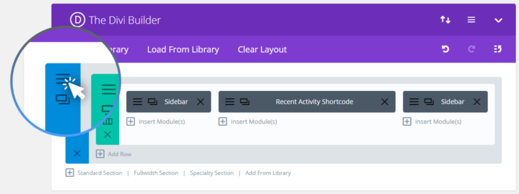
Now open a section settings:
Go to Advanced tab and paste our Custom CSS class “full-width-mobile” (without the dot at the beginning) from the first step:
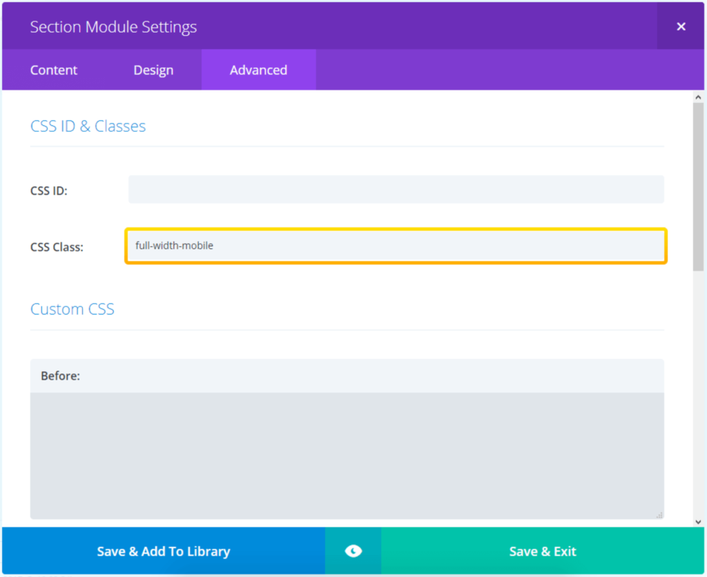
Save & Exit and Save / Publish page changes.
That’s it! Now repeat the second step on other PeepSo Pages and you’re done.
The Result
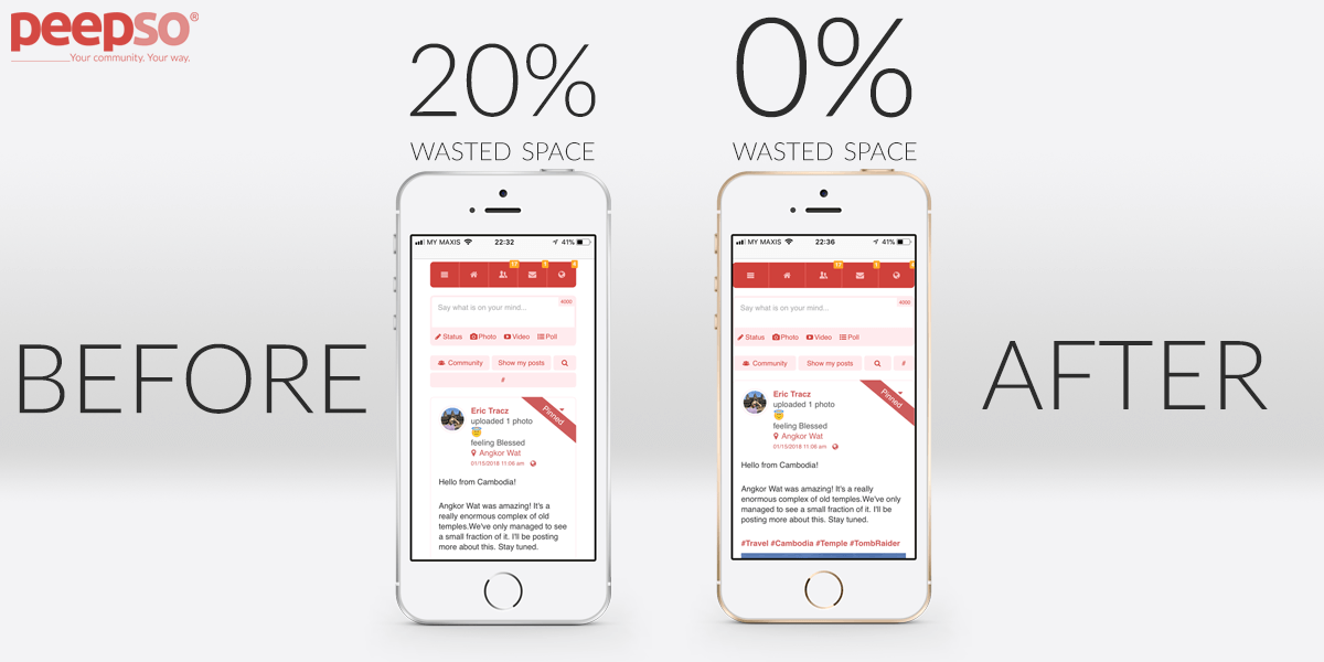
The results are like you can see below. Edge-to-edge community. No distractions and no wasted space on the screen. These are screenshots from iPhone SE, a relatively small-screen phone and yet, everything is clear and comfortable to use.



Reactions & comments
Comments